PICK YOUR COLOR
MIDNIGHT BLUE
Our Midnight Blue is somewhat bewitching. It is dark, as mysterious as the night and as deep as the ocean. It conveys both a nautical effect and royal elegance. It is both majestic and obscure. This color blends in exquisitely with light colors such as whites or beiges by giving them a whole new personality. With warm hues, it creates an ambiance evocative of the colorful landscapes of the South.
DENIM BLUEOur Denim Blue is indicative of aquatic shades and beautiful summer skies. It is vibrant and electric. With its childish spirit, it isn’t hard to imagine it in a playroom or a child’s bedroom. It is lively and it enhances the colors that surround it. Traditional or metallic greys, wood or different intensities of white all come to life and this particular blue changes an ambiance with its unique presence.
TURQUOISE
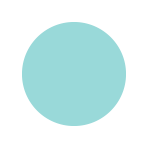
Our Turquoise is both mineral and aquatic. A soft color reminiscent of glass and precious stones. This hue transports us to the coasts of Greece and to environments filled with calm and serenity. It can be soothing and inspiring and can blend in anywhere without being obtrusive. In a bathroom, it conveys the purity of water; in a living room, it inspires calm and serenity; in a kitchen, it recalls the retro colors of the 50s.
MOSS GREENOur Moss Green is, of course, inspired by nature – the lush fields in Ireland and the summer leaves bristling in the wind. It is also symbolic of the tartness of limes and the earthy flavours of basil and mint. This color can also add a designer’s touch and a natural look to an industrial setting. A green as perky and vibrant can only add freshness and light to any room.
CANARY YELLOW
It’s difficult to find a color as bright and sunny as our Canary Yellow. It is reminiscent of summer sunshine and fresh lemonade. It really conveys happiness. Both energizing and electrifying, this particular color adds a radiant touch to an office, a fragrant lemony touch to a kitchen or a joyful brightness to any room.
ORANGE
Our Orange has many features, each as inspiring as the next. As bright as the setting sun and as fruity as a freshly squeezed orange, it is similar to that of the hot colors in the South. It has an urban and energizing feel when matched with greys, blues, white and black. When matched with wood, browns or beiges, it recalls autumn and the comfort and coziness of a warm home.
RED
Our Red is proud and powerful. It can convey a classical look or a brilliant festive touch. It is reminiscent of passion and southern climes and it can be compared to the feisty and warm flame of a campfire. It also recalls the fruitiness of a strawberry and the spicy bite of a chili pepper. Depending on where it is placed, it can be youthful, traditional, urban, exotic and stimulating.
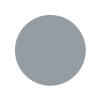
ANODIZED ALUMINUM (PAINT) • GRAVEL GREY • CHARCOALEvery one of our greys has its own personality. Painted anodized aluminum, with its clear tone and metallic effect, provides an interesting industrial touch.Gravel grey, which combines that softness of grey and white, is perfectly balanced and is neutral yet conveys a certain designer’s touch.Finally, Charcoal is deeper and more somber and conveys both an urban and organic feel. Although all three have their distinct personality, the thing they have in common is their flexibility as well as minimalist and neutral qualities. They can be subtle and traditional or contrasting and modern.
ESPRESSO
The richness of our Espresso is remindful of a cup of full-bodied coffee and the raw elegance of wood. This color has a character of its own and conveys a sophisticated look to your decor. Warm and luxurious, it blends in with various settings. Alongside sandy, soft white or metallic hues, it adds a certain flavour to any room.
BLACK
The depth of our Black makes it distinctive. It is bold but blends in with both elegant and industrial settings. It can add dramatic contrast as well as decadent luxury. Both pure and dark, it is surprisingly versatile. It’s a perfect match for wood or metallic surroundings. It stands out in the presence of various colors and creates unity in an eclectic decor.
SPECIAL FINISHES
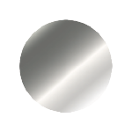
Our special finishes stand out because of the distinguished look they provide to any setting. Our Anodized Aluminum has a lighter hue whereas our Stainless Steel is slightly darker. Their particular feature is they can either provide an urban feel or simply exist as the raw metal they represent. These colors are versatile in that they blend in perfectly with any setting allowing all the other shades in an environment to shine and take the place they deserve.
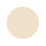
ALMOND
Symbol of elegance and distinction, our Almond color is timeless. Enhancing all spaces and matching all color palettes, this velvety beige is perfect for classic or rustic decors.This soft and comforting shade lends itself well to natural materials such as wood, linen and rattan. Its versatility makes it a choice that will stand the test of time.
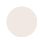
WHITE • SOFT WHITE
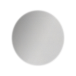
Our standard Whites are two colors imbued with simplicity. Our basic White is pure and fresh like the driven snow. Our Soft White is reminiscent of the limpidity of a pearl and is warmer and softer.Both colors easily fit into any environment and add sparkle and clarity to a room. They are also versatile and remain classics in a variety of settings.


